18. Quiz 2
Quiz 2
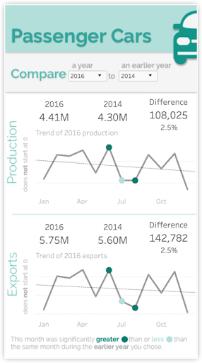
QUESTION:
The above indicated mobile design was a challenge for me to fit into a screen. I see opportunities for improvement. How might you modify the alignment of various elements here to improve the readability of this dashboard?
ANSWER:
Here are some possible solutions:
- Shrinking text never improves readability
- Adjust the text in the grey area so the sentence doesn’t read jaggedly. Reducing the jaggedness of this odd sentence layout would greatly improve legibility
- Full month names might be slightly more clear, but they are common abbreviations and full month names are much longer than three letters, so the text would likely look crowded.
- Change the orientation of Production and Exports to read horizontally.
Horizontal text reads much more clearly and speedily than any other orientation. - Replace the long word “Difference” in the last KPI with the shorter work “Change” and place that word beside the number referring to the change.
You often want to replace a more verbose words with one that are shorter where space is limited and you aren’t sacrificing any meaning. By placing this word closer to the number the association is tighter. You will also benefit by having all you KPI take up two lines of text instead of this KPI previous spanning three lines.